
Artwork
CMYK vs Pantone for custom boxes: cost, colour match and which to pick
September 24, 20266 min readWritten by the BoxCrisp team
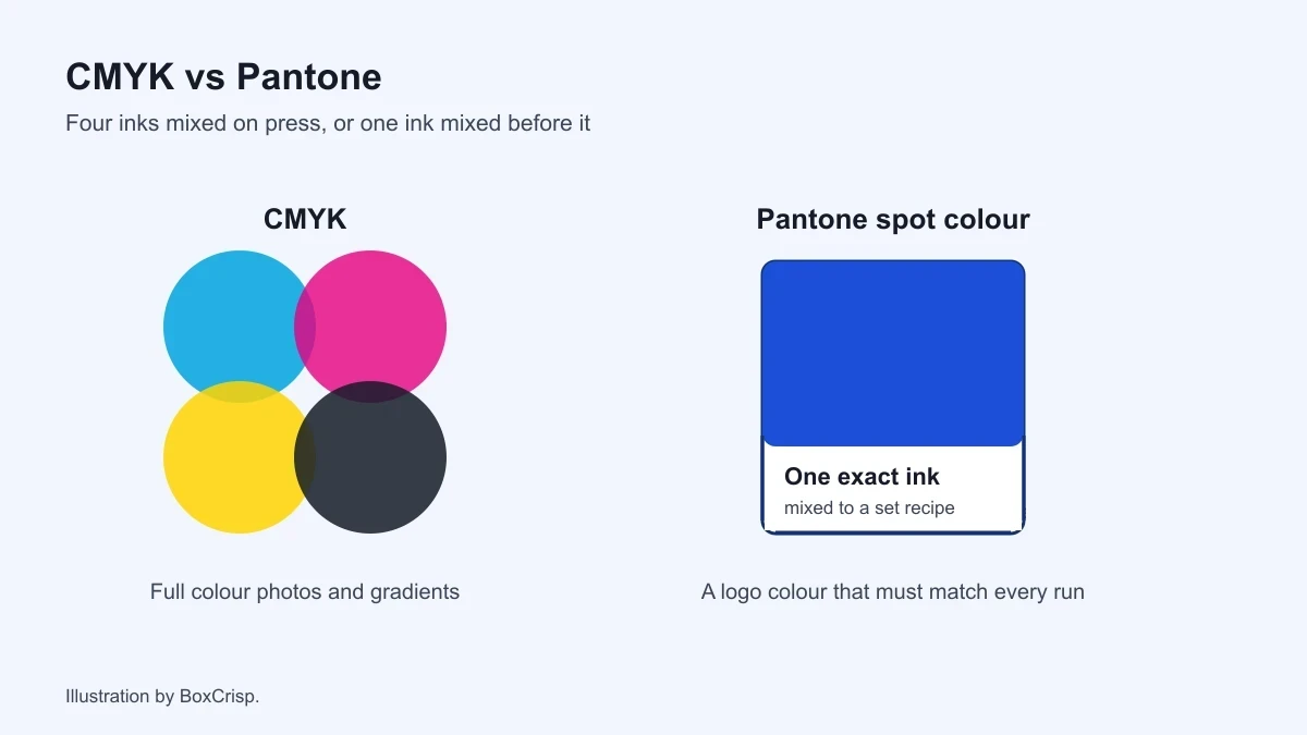

CMYK vs Pantone comes down to one question: does a colour on your box have to match the same colour everywhere else your brand shows up? If it does, a Pantone ink is worth asking about. If it doesn't, CMYK prints photos, gradients and full colour artwork on every face, and that's what most first runs should use.
The question often starts when a printed blue looks a little different from the same blue on a website. Here's how the two work, what each costs on a real order, and which one we'd pick for you.
What CMYK and Pantone actually mean
CMYK is four inks: cyan, magenta, yellow, and black. The press lays tiny dots of each on top of each other, and your eye blends them into every other colour. It's how photographs, gradients and busy illustrations get onto a box, and it's the standard for full colour packaging.
Pantone is a numbered library of premixed inks. Instead of building a colour out of four dots, the printer mixes that exact shade first and prints it as one solid ink. Brands quote a Pantone number, like 286 C, so that their colour comes out the same from one supplier to the next. Pantone publishes how its colour systems work (opens in a new tab) if you want the long version.
The short version: CMYK builds a colour, and Pantone mixes it.
CMYK vs Pantone side by side
| CMYK | Pantone (spot) ink | |
|---|---|---|
| How the colour is made | Four inks in dots | One premixed ink |
| Best at | Photos, gradients, many colours | Flat logos, one brand colour |
| Colour consistency | Close, varies slightly run to run | The most repeatable option |
| Hardest colours | Bright orange, vivid blue, neon | Anything that needs a photo |
| Where it shows up | Full colour boxes | One or two colour logo jobs |
Neither is better across the board. They're good at different jobs.
What each costs on a mailer box
These come straight from our estimator for a medium mailer box with no finish, the same numbers you'll see on the pricing page:
| Quantity | One colour logo | Full colour (CMYK) |
|---|---|---|
| 250 | $1.82 a box | $2.21 a box |
| 500 | $1.28 a box | $1.57 a box |
| 1,000 | $1.15 a box | $1.40 a box |
So a single colour logo saves about 18% against full colour at every quantity. On 500 mailers, that's around $145. That's real money on a first order, and it's the main reason a one-colour design is worth considering before you commit to full coverage.
Full colour and one colour are print options. A Pantone match is a request on top. If a colour has to be exact, tell us the Pantone number when you ask for a quote, and we'll say plainly whether it can be hit on your board.
When Pantone is worth it
Pick a matched ink when:
- Your brand colour is the brand. If people know you by one shade of teal, a four-colour version that drifts a little between runs will bother you more than it bothers anyone else, and you'll notice it on the shelf.
- Your design is a flat logo on plain board. One solid ink is clean, crisp, and often the cheaper job anyway.
- You reorder a lot. A brand that sells steadily reorders several times a year. A mixed ink is the most repeatable way to make box number four look like box number one.
When CMYK is the better call
Stay with CMYK when:
- The artwork has a photo, a gradient or more than two colours. Matching five separate inks is slower and dearer than printing it in four.
- You're still testing the design. First runs change. Don't pay for colour precision on a box you'll redraw in two months.
- Your colours are ordinary. Most navies, blacks, reds and greens print very close in CMYK. It's the bright, saturated ones that struggle.
Our honest opinion: for most first orders, full colour CMYK with a decent proof is the right choice. Save the Pantone conversation for the one colour you'd actually lose sleep over.
Pantone C and U, and why the same number looks different
A Pantone number often ends in a letter. C means coated and U means uncoated. The same ink printed on glossy, coated board sits on top and looks bright and clean. Printed on uncoated board, it soaks in a little and looks softer and darker. So 286 C and 286 U are one ink that looks like two colours.
Match the letter to the board your box is printed on. If your brand guide only lists the C version and your box is uncoated, expect it to come out a shade duller, and judge it on a printed sample rather than on the swatch.
A note on black
Black is where CMYK files most often go wrong. Plain black (100% K) prints as a slightly flat, dark grey on a large area. Printers build a deeper "rich black" by adding some of the other three inks under it. That's great for a big black panel and bad for small text, because four inks have to line up perfectly and any drift leaves a coloured edge. So use rich black for large areas and plain black for fine text and thin lines.
The mistakes that cost people a reprint
Designing in RGB. Screens use red, green and blue light, and the brightest screen colours simply don't exist in ink. Send artwork in CMYK, or tell us the Pantone, and you won't get a surprise at proof. Our guide to what a dieline is covers the rest of the file setup.
Judging colour on a monitor. Your screen emits light and a box reflects it, so they'll never match exactly. Order a sample pack and look at printed board in daylight before you sign off a colour.
Forgetting what kraft does. Printing onto brown kraft boxes shifts every colour darker and warmer, and white ink behaves differently again. A light blue on kraft comes out closer to grey green. If the exact shade matters, print on white board.
Approving a proof in a hurry. Once you approve a proof, the colour on it is what gets made. Check it properly.
Which should you choose?
If your box carries a single logo in one brand colour, go one colour and name the Pantone. You'll save about 18% and get the most consistent result. If your box is a full design with photos or several colours, go full colour CMYK, and use a sample to judge the tricky shades. If you're unsure, send us the artwork. We'll tell you which one we'd pick and why, including when the cheaper option is the right one.
We add your logo free on every order, reorders included, so it costs nothing to ask. See how that works in our guide to custom boxes with your logo, or price a box now on our custom mailer boxes page.
Key takeaways
- CMYK mixes four inks to print any colour, including photos. Pantone prints one premixed ink for an exact, repeatable shade.
- A one colour mailer costs about 18% less than full colour: $1.28 against $1.57 each at 500.
- Choose Pantone when a single brand colour has to match everywhere. Choose CMYK for photos, gradients and first runs.
- Send files in CMYK, not RGB, and judge colour on printed board, never on a screen.
- Kraft darkens and warms every colour, so print critical colours on white board.
Common questions
Is Pantone more expensive than CMYK?
Not always. A one-colour logo in a matched ink is often cheaper than full colour, about 18% less on our mailers. It gets expensive when a design needs several matched inks, because each one is mixed and run on its own.
Can you print my exact Pantone colour?
Tell us the number when you ask for a quote. Most colours can be matched closely on white board. Kraft and very bright colours are harder, and we'll say so before you order rather than after.
Why does my box look different from my screen?
A screen makes colour with light and a box reflects it, so they can't match perfectly. Bright screen colours often fall outside what ink can print. A sample pack is the quickest way to see real printed colour.
Should my artwork file be RGB or CMYK?
CMYK, or CMYK plus the Pantone numbers for any colour that has to be exact. An RGB file gets converted at print, and the brightest colours usually come out duller.
Does kraft board change printed colours?
Yes. Kraft is brown, so every colour prints darker and warmer on it. If a colour has to be exact, choose white board.
Next step
Price one colour against full colour
Switch the print option in our estimator and see the difference on your own box, then send it for a free quote.
Open the estimatorThe boxes themselves
Formats this applies to
Every one of these is printed to your brand, starts at 100 units and comes with free design and a proof before anything goes on press.
Keep reading
More from the guides
Shipping
Custom packaging for Etsy sellers: when a printed box pays, and what it costs per order
Custom packaging for Etsy, worked out per order: when a printed mailer pays for itself, sizes that keep USPS postage low, and real prices from 100 boxes.
October 19, 2026 · 10 min
Artwork
Custom window boxes: where to cut the window, which film, and what it costs
Custom window boxes explained: where to cut the window, PET or PLA film, how to design artwork around it, and real prices from 100 boxes.
October 15, 2026 · 10 min
Materials
Custom bakery boxes: sizes, food safe board and real holiday prices
Custom bakery boxes sized for cupcakes, cookies, pies and cakes, with food safe board explained, real prices from 100 boxes and a Thanksgiving order timeline.
October 14, 2026 · 10 min
Want us to sanity check your box?
Rather just email? hello@boxcrisp.com